Monday 18 October 2010

Self Evaluation - Alphabet Soup

Which personality traits did you choose to respond to and apply the typeface?

- Direction
- Music Lover
- Optimist/Pessimist
- Bold
- Tall

What are the reasons behind the design decisions you have made for the typeface?

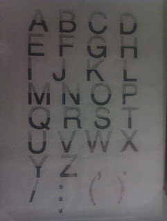
I chose to make the typeface based around Helvetica, this was Matt's favorite typeface, this was the starting point for my project, the other words which i gathered from the conversation we had where Uppercase, Lupae Fiasco, Bloc Party, Arctic Monkeys, Prodigy, Modern, Simple, Computerised, Rugby/Basketball , Lancaster, Cheesy Chips, Ticket Seller, Sharp/Witty, Bold, Over Elaborate, Showoff, Optimist/Pessimist. 

All these then gave me a lot of room for experimentation and would give me the chance to be very creative with the outcome i could do with the design, the five words which i picked out at the top are the ones which i picked out to give my design direction so i didn't go to far off the brief.


In what ways are the results effective?

I believe that my designs worked well because they all convey Matt's personality such as him being a music lover and having direction in his life, the way that i showed that Matt was a music lover was through how the lines that portrayed upwards showed three things, he was tall, had direction to his life and an equalizer which you would find in music studios, then i had the bottom part of the letter to show the optimist/pessimist area of things as its the half full, half empty scenario, but then on the final outcome ill keep this crisp and sharp to keep the message clear and defined.

Sunday 17 October 2010

Crit Feedback Alphabet Soup Phase 2


Issues Raised...

- Test Lowercase letters on development sheets 

- Solid bottom looks slightly contrasting to the concept due to me saying pessimist and optimist 

- The badge could lose some detail when point size is smaller but overall works as it still gives enough 
   detail which draws your attention into it and makes you look harder.

- Try creating some sentences to see if it would work as a  type face

- Interesting and has strength from close and a distance, the concept has a strong outcome. change the 
   few issues which has been listed above and overall it will be successful design outcome.


Action To Be Taken...

- Redo the final outcome on the A1 sheet and make it neater, also change the bottom area to a solid   
   black crisp outline and then the lines only on the top area!

- Scale down brackets to fit into the area better so they dont run off the page

- Dont mess up on the colons 

- Test the letter 'J's positioning as it could look better to the right but it then could leave to large of a gap 
   to the left and look more awkward.

Thursday 14 October 2010

Final Images "Alphabet Soup" Phase 2


These are the images that i have created for my final outcome of the Alphabet Soup phase two section. The upper part of the image is created to show that Matthew Chatfield has direction to his life, and also to have the effect of an equalizer. which you would find in the music industry. Then the bottom section where it has been filled in black, this shows the half full, half empty way of looking into things and this describes how he used to once be a pessimist but he is now a huge optimist always looking on the bright side, overall i think that the work worked well and answers the brief. I have had a lot of positive feedback from classmates and my partner, hopefully the crit will go the same.

Monday 11 October 2010

Problem Analysis - Alphabet Soup Phase 2 Rational


Brief...

Design a typeface that communicates Matthew Chattfields personality 


Who is your audience?

Matthew Chattfield, and also the rest of my classmates.


What do they need to know?

The letter forms that i create for Matt need to be legible, readable and communicate the personality of your partner to the rest of my crit group.


Why do they need to know?

They need to know because the brief demands that your partners personality is reflected within the typeface that you create for them.


How will you respond to this?

I will show Matt's personality and characteristics within the letters and glyphs.


What primary research is required ?

First hand information (talk to Matt)
Jot down characteristics of Matts personality 


What secondary research is required?

Typefaces 

Self Evaluation - Alphabet Soup Phase 1


What is being communicated and how?

My letter forms had to communicate the word "Vanish" to do this i had to range through a variety of diffrent styles and design concepts to try and make the letter forms legible and readable yet still display the Vanish. My first idea was to play around with vanishing points and point size but i needed to be more create than this and make it more appealing to the eye. 


How well does this answer the brief?

I believe that my design answered the brief very well as when the red acetate was placed over the top the letter became visible but until this happened it was difficult to see it as the red pattern which was the word vanish typed over and over, which had a strong kerning and leading on it to create a repetitive pattern to make it illegible. I did this with all ten of the letters which i created and they all worked with each other.


How well has the idea been visually explored ?

I went through a large amount of design research and exploration into how i could make this "Vanish", i had some other ideas which were things such as, having loads of tracing paper over the top of each other until the back letter became invisible. There are many varieties of these in my sketchbooks and i have took some pictures and placed them onto my blog to show this.


What are the strengths of the resolution?

 Overall the whole body of work shows how i went from research to experimentation to development and finally creating my outcomes which i think were strong yet could be improved slightly. 


How could it be improved ?

The ways in which i would improve my final designs, would be to make the letters which were placed in the background behind the pattern to a more relevant choice of letters. I should have written out something which was typographic based, i think apart from that my project was very strong and answered the brief.

Self Evaluation - How To


What role(s) did you take on in the group ?

Poster designer, Group idea generator


How well do you think you preformed in the role(s)?

I believe the posters i created work well in the overall outcome and it all links together well with the packaging and the envelope that was created. All of this links together with the title that we give the project "balance"


How well do you think you worked as a group?

I think the group worked well together and everyone contributed to the final outcomes which all worked well. Each person carried there own weight and made sure that it all worked in unison with each other.


What were the positives of working in a group?

The idea generation process was a lot faster and we got onto designing the products straight away 


What were the negatives of working in a group ?

Harder to get some of the design work done as trying to get the whole group together at the same time to make decisions proved hard and also when you are waiting for certain aspects of the brief from someone who then is late can create a step back in your time limits


What will you do differently next time ?

Create the final outcomes and generate more work 


Where could you have improved your resolution ?

More information and packaging which could help out more 


What were the strengths of your presentation ?

The concept was strong and the speech worked well, this is what created a strong answer to the design brief and made this a successful answer to the problem.

Problem Analysis - How To Rational

The Brief ... (What is the problem you need to solve)

You have a problem to solve. use your conceptual and practical design skills to solve the problem in an appropriate and creative manner. Your solution should take into account the receiving audience and make use of methods of audience interaction.


What do you need to communicate?... (Be clear and specific.)


An understanding of the brief by designing a way to which we could help students new to university concentrate and get there work done in the starting weeks. This could be done numerous ways but our group will find the best solution for this problem.


Why do they need to know?... (The concept of your problem)

This is to help them find simple and easy ways to get the best from the course which they are paying for and also to make them understand what they are needing to complete in able to complete there university course.


What will they respond to? (Will they see / watch /buy / wearing)

The general idea at first is to create a freshers pack which is the opposite to what you would expect... this would then be the anti freshers pack, this would include things such as motivational posters, pens pencils ect, these would all work together as a pack and create a answer to the brief that we believe would be a highly successful outcome.


Where do they go? (how will they access / receive / discover)

These would be handed out at freshers fairs or around the university campus when the new students arrive, they could even be left in the accommodation, this would more likely be a successful way to make sure all students got one and then the students which would be interested in this would put it to best use.

Friday 1 October 2010

Final Images "Alphabet Soup"

These are image of my final pieces which i created, the top image is acetate which has a red block printed onto it which then gives the vision of making the rest of the red pattern over the top vanish once it has been placed over the top, however i think that the letters which i used could have had a more of a meaningful variety of the letters, but the outcome still worked for the concept which i had created.