I wanted to make sure that i created a whole new image for myself as last year my professional image as Maaron just didn't work out well. For starters it didn't help that it resembled the word Moron and also it was very badly designed, too a point where you are unable to place it on any of my designs because it became too complex
Below is the new branding which i'm really happy with and I think delivers who I am as a professional designer.
___
LETTERHEAD


There is this simple log of contact information at the bottom of the page, this is something that I think can deliver a clear message so that people see the information and know what to do if they need to contact me.
___
COMPLIMENT SLIP

Back

Front
___
BUSINESS CARD

Front

Back
This is something that i'm going to try and get completed tomorrow morning. I want to emboss the section where my logo is, then on the back i want to get rid of the colour and this will allow me to have a very clean & minimalist side to things.
___
INVOICE
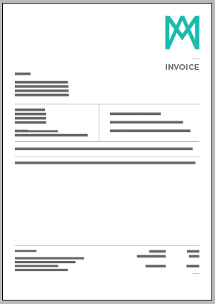


This is the basis of what i want to get from my design however there isn't much room on there for me to be able to get the most out of it. After speaking to Andy, we both agreed that making more space on the top section were everything can be placed together will allow for more space when the description is, this is where the client would want the most information so this is something that is rather necessary to be completed.

This was an extension page which was created incase of not having enough space on the other page, this is something that would be better to have to miss out using, I may even have to re create this by taking off the logo at the top and pushing up the rest of the documentation, obviously this wouldn't be needed if it were stapled to the other sheet.
No comments:
Post a Comment